An-Hsin Chen

Medical Device UI

Make critical information accessible and actionable in emergency.

I redesigned the LVAD (mechanical heart pump) controller alert system and created step-by-step animation guides for parents managing their toddlers’ devices at home. 

Parents with minimal medical training face a high-stakes environment where mistakes could be fatal.

When I first encountered the PediaFlow project, I was struck by a critical gap in pediatric healthcare: While Ventricular Assist Devices (VADs) save lives, they weren’t designed with home use by non-medical caregivers in mind. Parents of toddlers with heart conditions face a terrifying reality – managing complex medical equipment with minimal training where mistakes could be fatal. The existing HeartMate III controller, designed for adults, displays cryptic messages like ‘Change Controller’ during emergencies, expecting users to recall complex procedures from a 300-page manual while under extreme stress.

Critical Time Pressure + Cognitive Overload

When a toddler’s heart pump controller malfunctions, parents have only 2 minutes to perform a replacement before their child loses consciousness.

HM3
Consequences
  • High stress during emergencies
  • Increased error potential
  • Life-threatening consequences

The current HeartMate III controller display : The interface is minimal and cryptic, displaying only basic icons and a “Call Hospital Contact” message during a controller fault.

This intersection of high-stakes healthcare and untrained users became my design challenge

How might we create interfaces that guide caregivers through life-critical procedures with confidence, even in moments of panic?

Design solution

I redesigned the alert interface to display step-by-step animated guidance, breaking down the replacement process into clear visual instructions. This removes the cognitive burden of memorizing procedures during emergencies and guides parents through the life-saving process with confidence.

Impact

I conducted a survey with 110 participants through Prolific, measuring user confidence and comprehension across different alert types. I also conducted a testing simulation and post-testing interview with 7 participants.

User confidence
73.2% participants rated

4~5

/5

Task completion
Complete within 2 minutes

7

/7 Participants

Interface affordance
Element recognition accuracy

85%

User profile

Through interviews with cardiac specialists and the PediaFlow team, I developed a profile of our primary users: parents with no medical background suddenly thrust into a caregiver role requiring complex medical device management.

Unlike medical professionals who gain comfort through repetition, these parents may face critical alerts only occasionally, meaning they have limited opportunity to develop muscle memory for emergency procedures. This insight became central to my design approach—I needed to create interfaces that provide just-in-time guidance rather than relying on recalled procedures.

Sarah Smith

25 y  |  Mother of Alex(2)  |  Full-time account  |  First-time parent

” I felt like I became a nurse overnight, but without the training. I’m terrified of making a mistake that could harm my child. “
Goals
  • Feel confident handling emergencies
  • Provide safe, effective care for Alex at home
  • Give Alex as normal childhood as possible
Frustration
  • Constant anxiety about making mistakes
  • Difficult to find specific information quickly
  • Difficult to interpret the data by paper-based tracking

Research

I approached my research from multiple angles to truly understand this unique user context.

Expert consultation

I consulted with cardiac specialists who had extensive experience with adult VAD patients.

Document review

I meticulously analyzed the 300-page manual to map out user activities in current experience flows.

User interview

I then interviewed 3 HeartMate 3 users to understand the pain points performing each user activites

Competitive analysis

I drew inspiration from other life-critical device and instruction diagram.

Task analysis

I conducted task analysis to understand the cognitive load and better to find design opportunities

Insights

Using Card Sorting, I organized my findings into three critical categories: daily scenarios (bathing, travel, pre-sleep), emergency troubleshooting, and data logging. (These only included those can be solved by digital product)

Daily routine
  • No immediate support when uncertain about procedures
  • Difficult to find information in extensive documentation
  • Caregivers express constant fear of making mistakes
  • Burden of remembering numerous rules for daily activities
Emergency
  • Difficulty remembering troubleshooting procedures during alerts
  • High stress situations impair memory recall of training
  • Limited to verbal descriptions when calling emergency line
Data management
  • Paper-based recording with no digital solution
  • Doctors can only view data during monthly visits
  • Parents forced to memorize normal biodata ranges
  • No real-time monitoring for caregivers or medical staff
  • Difficult to identify concerning patterns over time

Opportunities: Dual interface

From the research findings, the dual-interface approach emerged organically — separating critical functions that require immediate access from supportive features that benefit from richer interactions.

Controller UI
For Emergency display
  • Alert prompt indicator
  • Real-time blood flow data
  • Power indicator
Mobile app
For Daily routine + Data management
  • Daily routine guidances
  • Daily data login & manage
  • Communication with hospital team

Emergency task analysis

To understand the user cognitive load when during emergency, I conducted a task analysis following the “FDA Applying Human Factors and Usability Engineering to Medical Devices” guidelines, documenting detailed procedures, potential user errors, and harm prevention strategies. 

user model

Competitive analysis

With a clear understanding of the challenges, I drew inspiration from other life-critical devices designed for non-medical users — particularly AEDs and pacemakers. I also looked at some examples that involve in guiding users operate new devices in sequential steps. One good example is Nintendo Switch “Joy-Cons-Ring” instruction.

Kick off the design

I started with two key components: 1) The alert prompt and the 2) the step-by-step procedure. To simulate the situation, I prepared baby doll and cardboard device prototypes.

I used the ‘think aloud’ protocol with six participants with no medical background, deliberately choosing novices to test the universal readability of my interface.


ver1
ver1 ani

Learn & Improve

I first asked participants three question without providing any background information: “How do you understand the situation” ,” How do y interpret the information on the screen”, “What will you do?”

After going through all testing interfaces, I explained the project and the scenarios to the participants and asked: ” What information do you see first? “, ” What icon/ text will allow you better to understand the situation?”

During testing, I observed significant challenges with medical terminology confusion — participants didn’t understand terms like ‘driveline’ — and uncertainty about countdown timer implications.

The most revealing insight came from watching users attempt the procedure: while they could tell when they did something right (as the next step would light up), they had no guidance when making mistakes.

This led to a major design pivot: rather than static diagrams with text instructions, I developed step-by-step animations that visually demonstrated each action required.

I categorized the feedback into 3 main area of improvements:

Icon usage
  • Use universal warning symbols (triangle with exclamation mark)
  • Use more intuitive icons (heart or baby symbols)
Language usage
  • Create more concise, action-oriented directions
  • Use image or icon instead of terminology to refer to the items
Animation usage
  • Implement dynamic elements like blinking text to indicate urgency
  • Clear indictor showing user if they do right or wrong

Design iteration

I limited color usage to two high-contrast options, added numerical markers to clarify sequence, and used distinct colors (red and green) to differentiate between broken and new controllers.

Evaluation

I conducted a survey with 110 participants through Prolific, measuring user confidence and comprehension across different alert types. I also conducted a testing simulation and post-testing interview with 7 participants.

User confidence
73.2% participants rated

4~5

/5

Task completion
Complete within 2 minutes

7

/7 Participants

Interface affordance
Element recognition accuracy

85%

Reflection

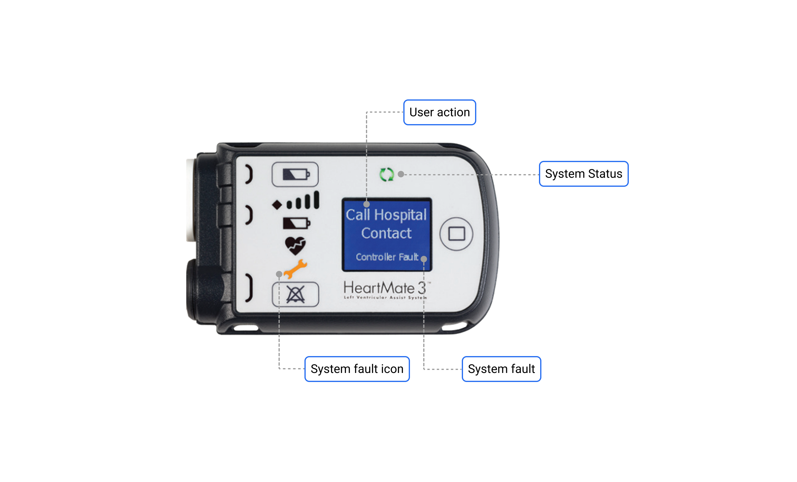
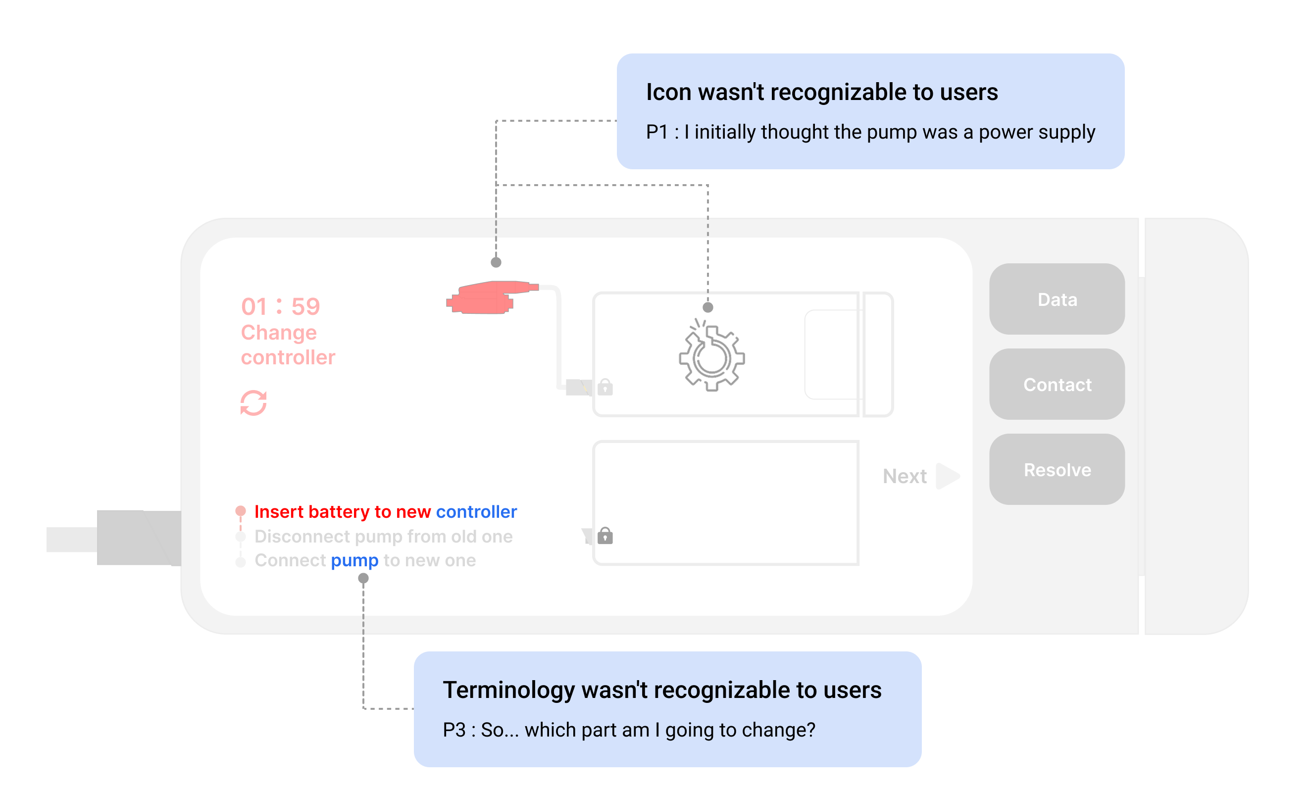
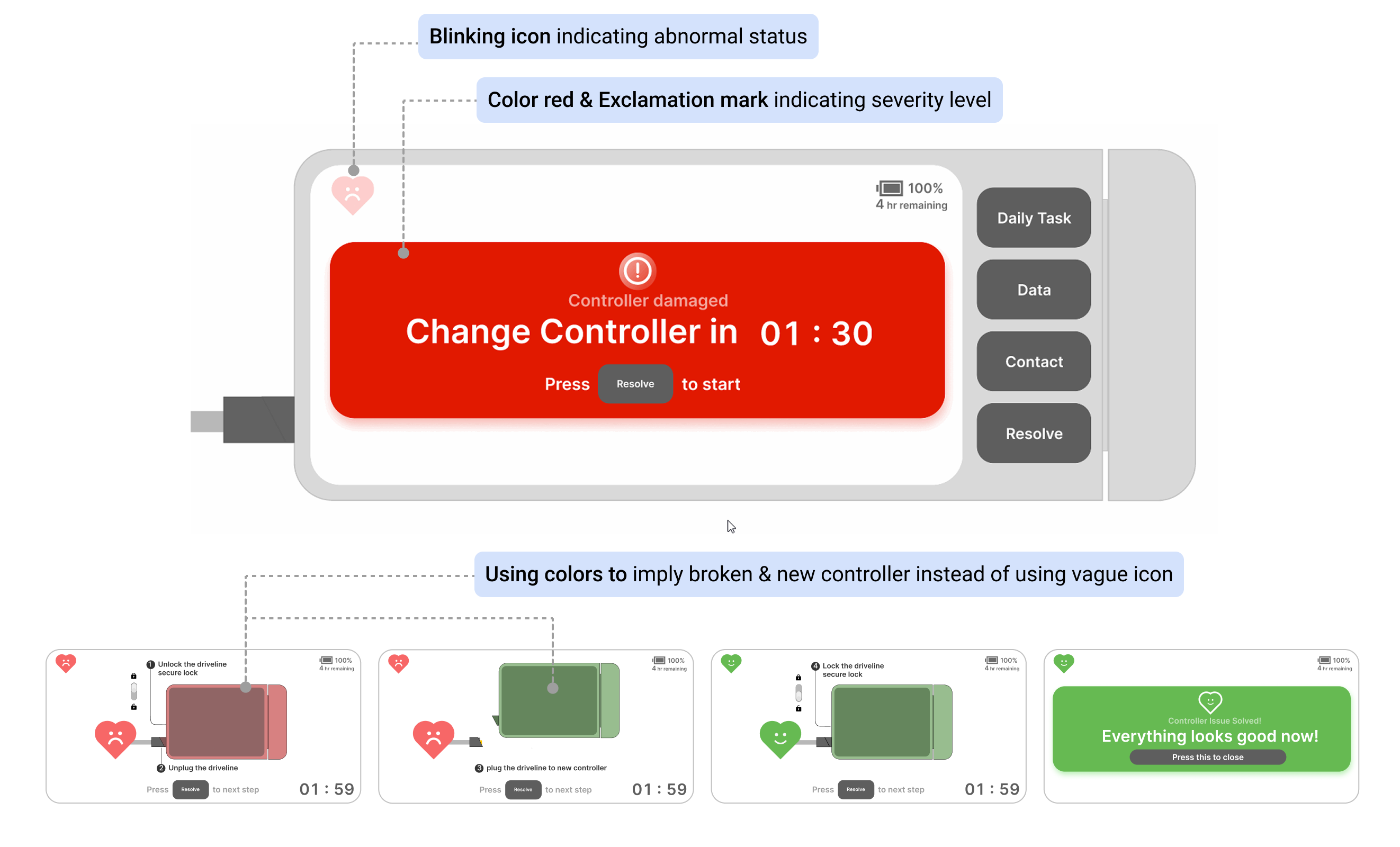
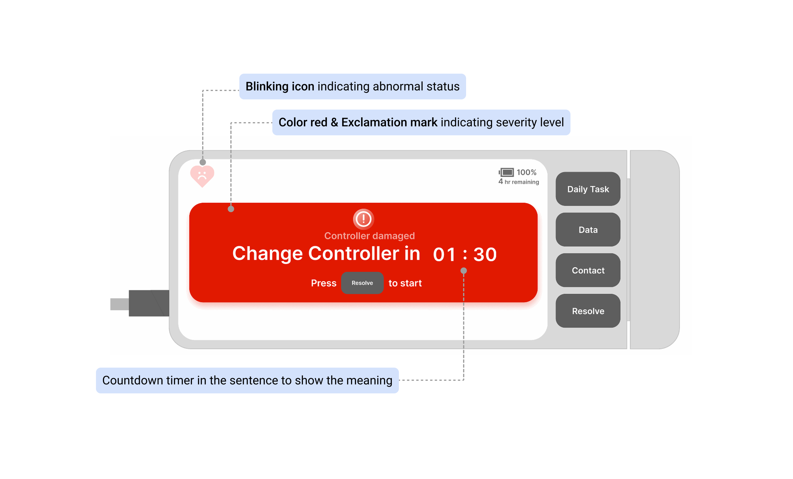
Universal Design is Life-Critical: Unlike commercial products where errors might lead to frustration or minor inconveniences, emergency response interfaces must work flawlessly across all user groups. This project reinforced that true accessibility isn’t merely about language accommodation—it demands universal visual communication through carefully selected icons and imagery that transcend cultural and linguistic barriers. When lives are at stake, there’s no room for misinterpretation.

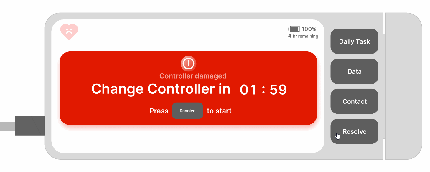
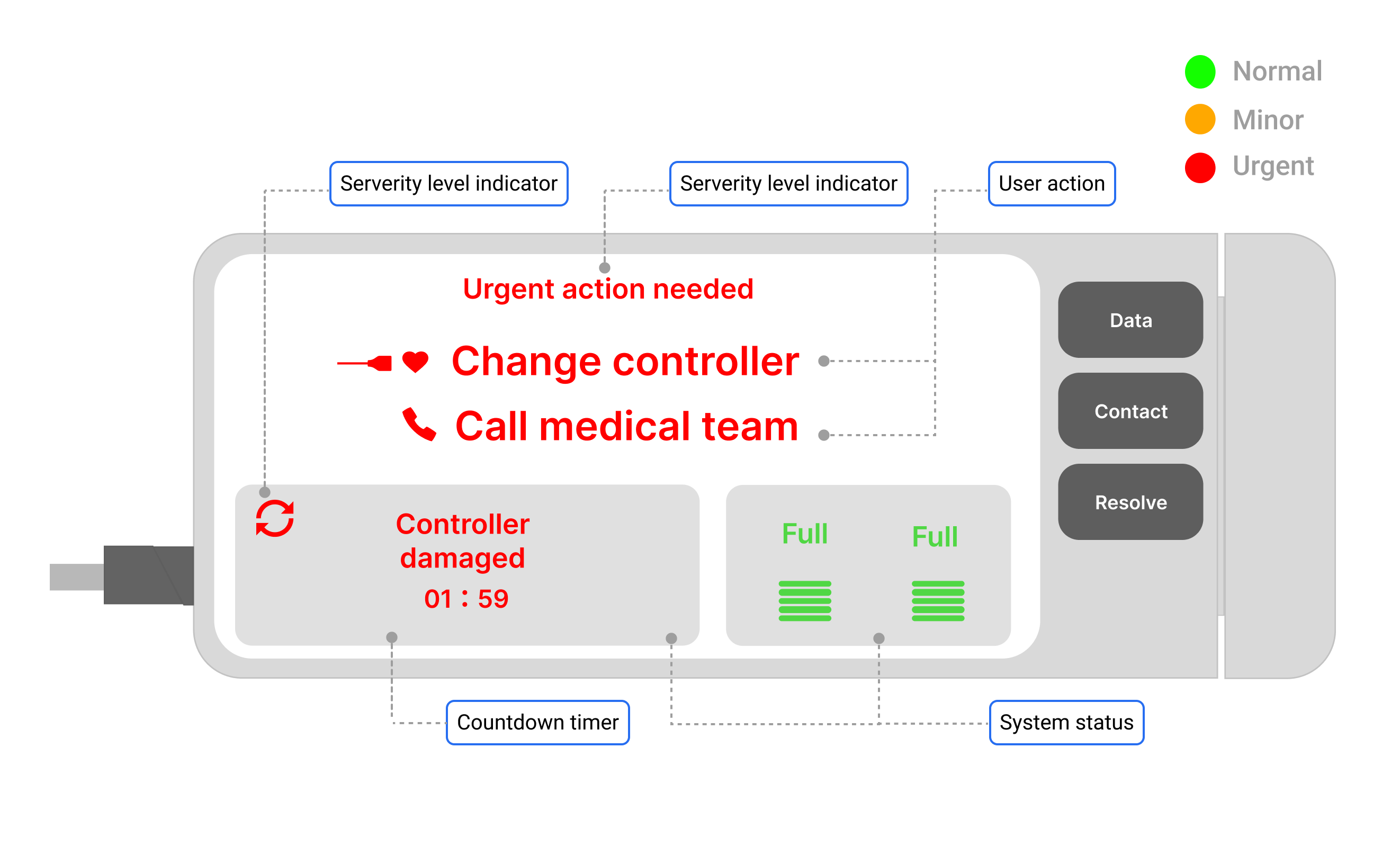
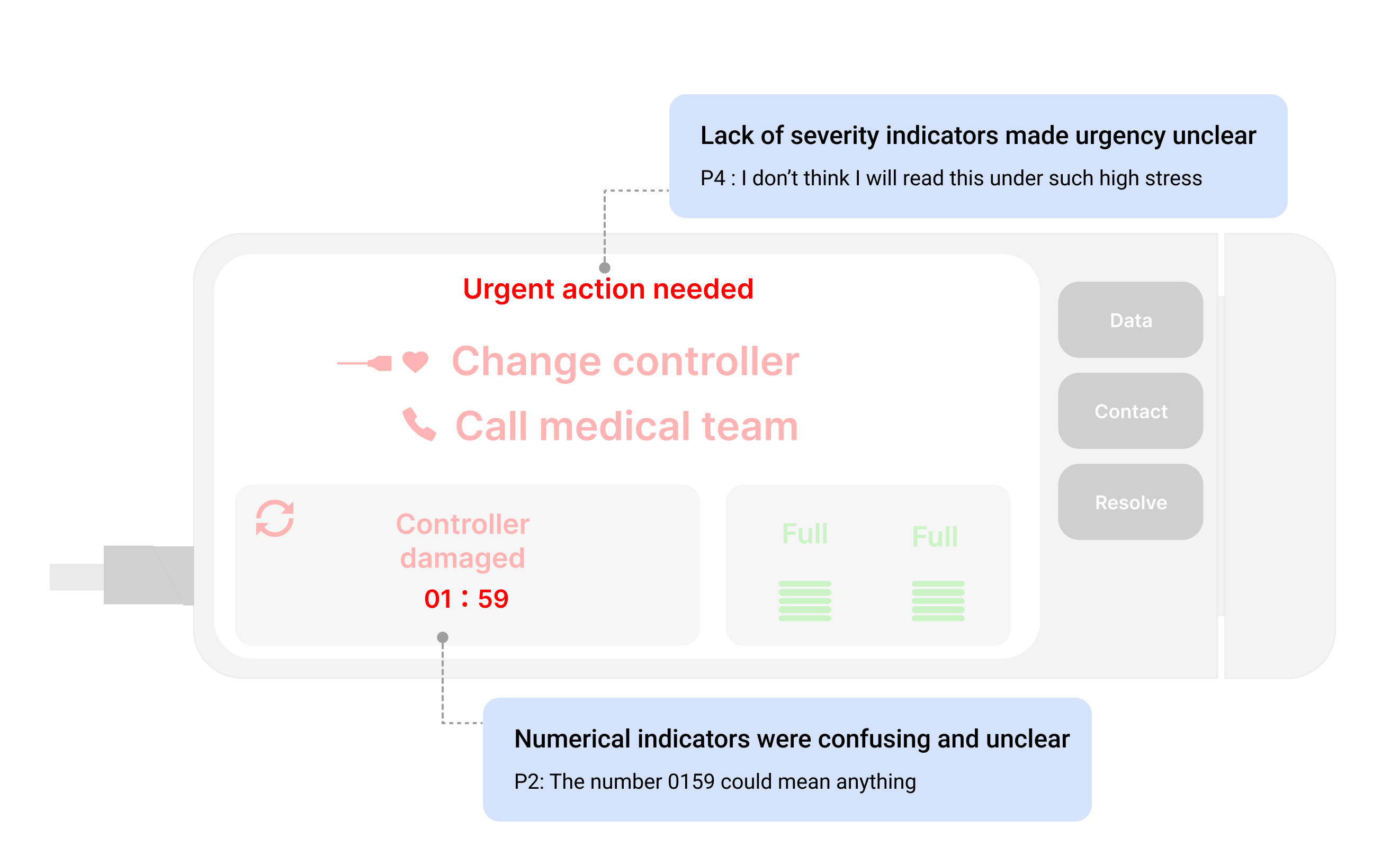
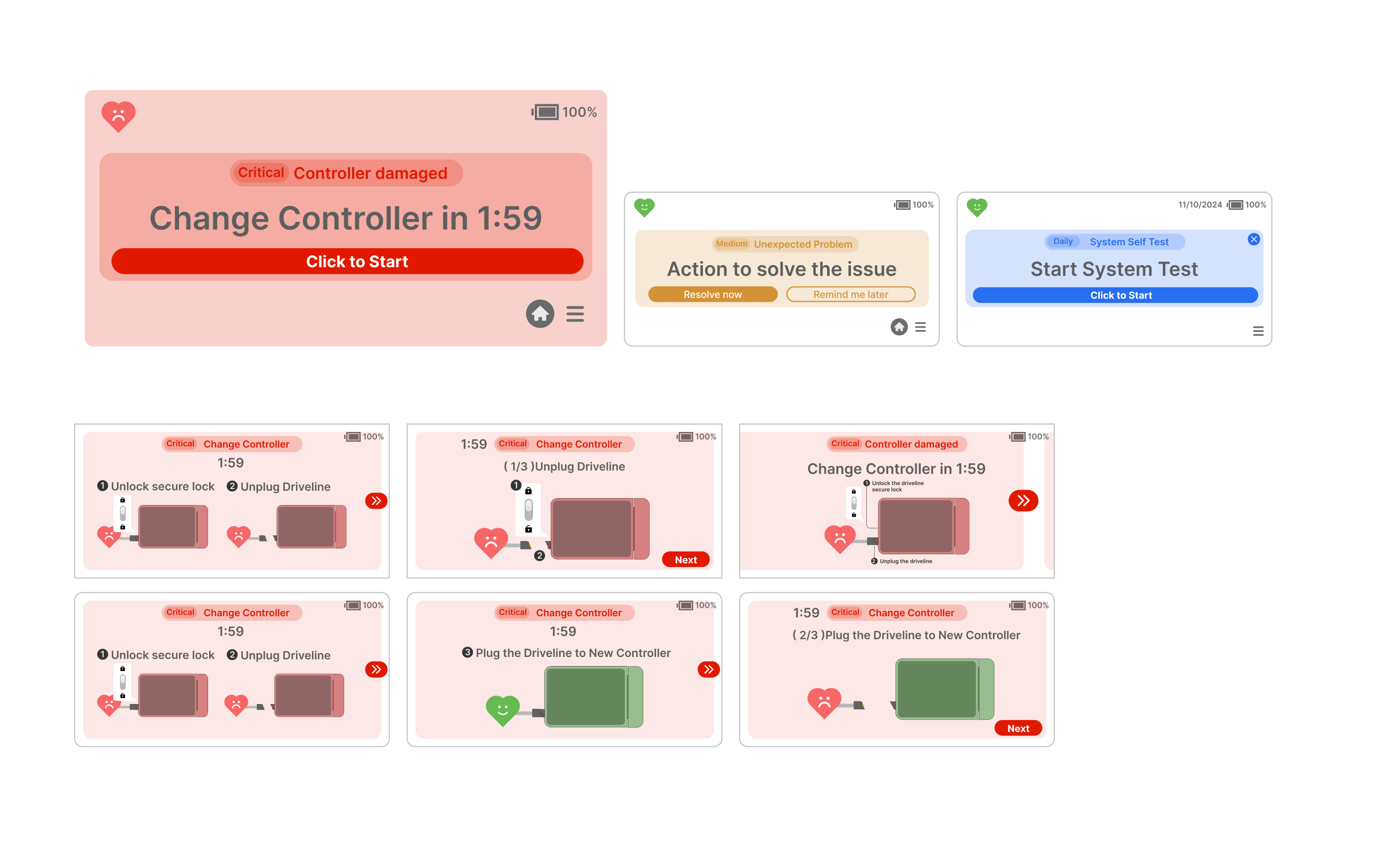
The Urgency-Calm Paradox: One of the most fascinating challenges was striking the delicate balance between conveying appropriate urgency while promoting the calm, focused mindset necessary for effective troubleshooting. This tension represents a unique design challenge that requires thoughtful color psychology, pacing of information, and reassuring interaction patterns that guide users without overwhelming them.

Demographic Considerations: The research revealed how significantly demographic factors influence emergency response behavior. Age, technical literacy, and prior experience with emergency situations all shaped how users interpreted and interacted with the interface. These insights reinforced the importance of designing with diverse user scenarios in mind rather than assuming a one-size-fits-all approach.

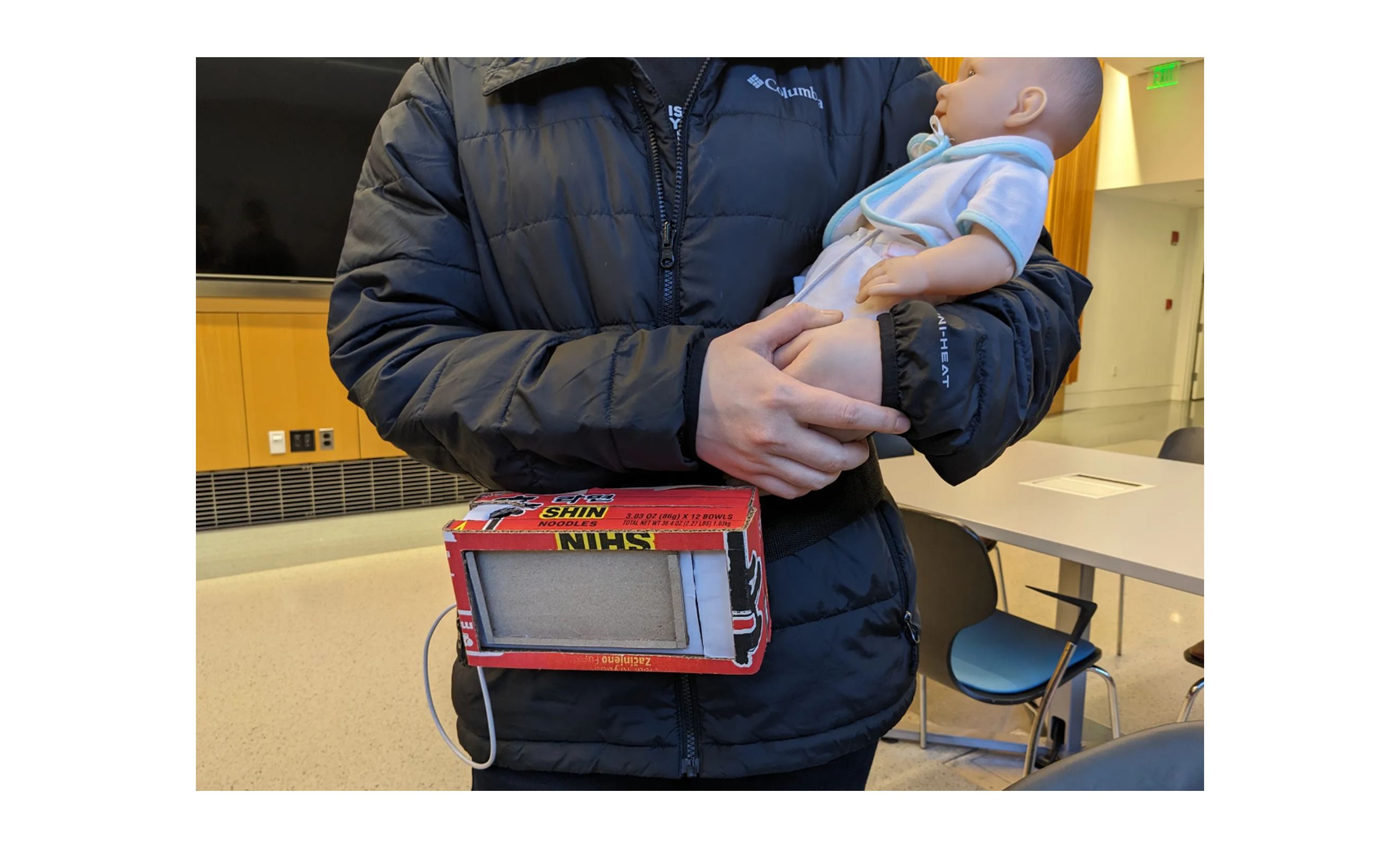
Simulation Testing Imperative: If I could revisit this project with additional resources, implementing simulated emergency scenarios would be my top priority. While our controlled testing provided valuable insights, observing users under conditions that more closely mimic the stress and constraints of actual emergencies would yield more authentic data about cognitive processing and decision-making under pressure.